In a customer survey via NPS (Net Promoter Score), the question "How likely is it that you will recommend XXX (insert product or service) to your friends and colleagues?" is intended to find out what the respondent thinks about the product/service and how satisfied he or she is with it. The rating is given on a scale of 0 - 10, whereby 0 is considered rather unlikely, 5 a neutral rating and 10 as extremely likely.
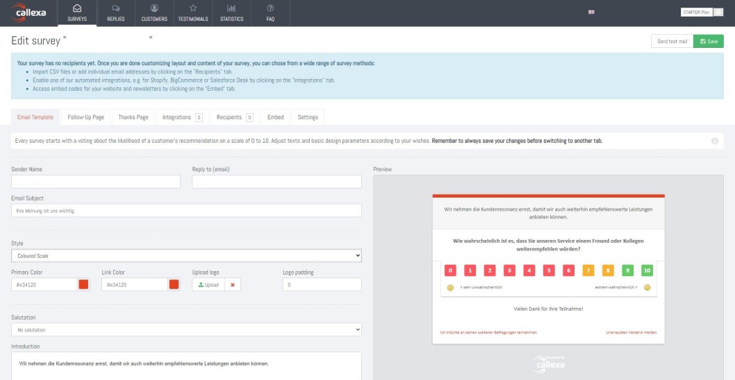
Unfortunately, many providers incline to adopt color visualization in their NPS survey. By using the colors in the scale, you clearly signal to the respondent which numbers are considered good and which numbers are considered warning or bad. This can distort the NPS because the respondent no longer sees the recommending thought in the foreground, which is the decisive factor in NPS.
A color visualization works excellently during analysis and in subsequent reports, as it can help to understand the mechanics of the Net Promoter Score. But showing this to the respondent can be a big mistake. It distorts the measurement and the NPS, which defeats the purpose of tracking customer satisfaction.
Please note: We do not recommend to activate this option as this can distort the NPS!
Log in to your account on our website https://www.callexa.com/en/login.
If you have already created a survey, please go to the details of the survey you want to use. To do so, click on the previously assigned name.
If you have not yet created a survey, please add one first. You can find instructions in our FAQ article "How can I create and customize a survey?".
Go to the tab "Email Template" and select "Coloured Scale" from the dropdown menu "Style" .
Click on "Save" in the upper section to apply the setting.
Comparing NPS is not a straightforward process as the customer satisfaction metric depends on many factors. This can be made clear on the basis of current studies. For example, companies in the automotive sector have an average NPS score of 39, with a lowest value of just 20. For Internet service providers, however, the average NPS value is 16, with a maximum value of only 19.
Discover how Net Promoter Score (NPS) can revolutionize customer feedback on your online portal. Learn to implement, analyze, and optimize NPS for better customer engagement and business growth.
Using a Net Promoter Score survey allows companies to learn more about customers. Evaluating and segmenting the feedback received enables a close look at customer behavior, gives an insight into needs and wishes and makes it clear which measures must be proactively taken to improve service, customer satisfaction and thus increase sales.
The Net Promoter Score (NPS) is a key metric that helps businesses gauge customer sentiment and identify areas for improvement. It's not just a metric but a powerful tool that can transform your marketing strategy. So, how can you leverage NPS to boost your business? Let's dive in and find out. In this comprehensive guide, we'll delve into how you can leverage NPS results to enhance your marketing strategy and drive growth.
Unlock the full potential of NPS surveys by tailoring them to your unique business needs. Learn how customization, integration with CRM, and actionable insights can transform customer feedback into growth opportunities.
Discover how automated NPS reporting transforms customer feedback into actionable insights, enhancing accuracy and efficiency. Dive into our guide for choosing the right tools and best practices for successful implementation.
The customer survey via Net Promoter Score® has the advantage over other forms of survey in that you receive relevant customer feedback promptly when you need it most.
Acquiring new customers is expensive and time-consuming. Anyone who has ever calculated the cost of acquiring a new customer knows this. The NPS can help you save a lot of money.
The annual customer survey, which has been taking place since 2014, is a reliable and important instrument for capturing the needs and requirements of Arvato customers and determining their satisfaction with Arvato solutions.